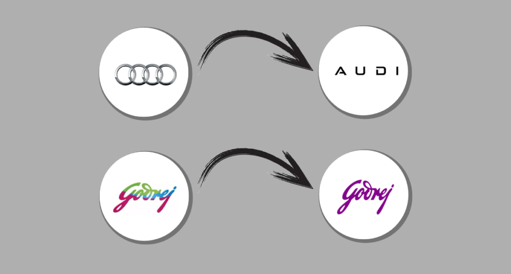
Branding is not just about logos; it’s about telling your audience who you are at a glance. Over the past decade of marketing, I’ve learned that logos are more than design elements—they are emotional triggers, identity markers, and brand promises. When two giants like Audi and Godrej undertake a logo redesign, it’s not just a design update; it’s a reflection of deep strategic thinking. The Audi and Godrej logo redesign exemplifies how minimalism and modernity can communicate a brand’s evolution and future direction at a single glance.
Let us look behind the scenes to explore why these redesigns matter and what they teach us about branding in today’s world.
Table of Contents
What’s in a Logo?
At first glance, a logo is just a combination of shapes, colors, and fonts. But its purpose goes far beyond aesthetics. A logo:
- Reflects Your Brand’s Identity: It’s the first thing people associate with your brand.
- Adapts to Changing Times: As consumer behaviors evolve, so must your brand’s visual identity.
- Creates Emotional Connections: A strong logo makes you feel something—trust, excitement, or even nostalgia.
Audi’s Minimalist Evolution
When Audi simplified its iconic four rings into a flat, two-dimensional design, some might have wondered, “Why fix something that isn’t broken?” But here’s where marketing insight comes in: Audi wasn’t “fixing” anything; it was preparing for the future.
Key Marketing Insights
- Digital First:
Audi’s redesign is a masterstroke for the digital age. Flat designs render better on screens, whether it’s a smartphone app or a car dashboard. - Future-Proofing:
With the rise of electric vehicles, Audi’s design reflects a clean, forward-thinking aesthetic. It’s a subtle nod to sustainability and innovation, values that resonate with today’s consumers. - Subtle Sophistication:
By opting for a more minimal look, Audi leans into a trend that defines luxury today: understated elegance.
What You Can Learn from Audi?
- Always think ahead. Your logo must work for tomorrow’s platforms, not just today’s.
- Simplify without losing identity. Audi kept its iconic rings intact, ensuring familiarity amidst change.
Godrej: Balancing Legacy and Modernity
Godrej’s logo redesign is a lesson in how to respect your heritage while embracing the present. The brand, deeply rooted in Indian households for over a century, took a bold step toward modernity without alienating its loyal customers.
Key Marketing Insights
- Bridging Generations:
Godrej’s redesign doesn’t erase its past—it honors it. The familiar swoosh and colors are still there, but they’ve been streamlined to appeal to younger audiences. - Relevance in the Digital Age:
The new logo works equally well on smartphone screens and product packaging. This adaptability ensures consistency across touchpoints. - Evolving Without Losing Trust:
Godrej managed to modernize its image while retaining the emotional connection it has with its customers, a rare feat in branding.
What You Can Learn from Godrej?
- Modernize, but don’t alienate. If your audience has strong emotional ties to your brand, retain elements of familiarity.
- Think multi-platform. A logo must look good on everything from an Instagram ad to a product label.
The Big Picture: Why Rebranding Matters in 2025?
Both Audi and Godrej have taught us that logos are more than just visuals—they’re statements of intent. Here’s why their decisions resonate:
- Adapting to Digital Needs: Flat, minimal designs are easier to scale and reproduce digitally.
- Appealing to New Audiences: Both brands aim to capture younger, more tech-savvy demographics without alienating their existing base.
- Staying Ahead of Trends: In branding, evolution is survival. Sticking to the old ways can make a brand feel outdated.
Key Differences Between Audi and Godrej’s Rebranding
| Aspect | Audi | Godrej |
| Purpose | Aligning with EV and tech trends | Bridging legacy and youth appeal |
| Design Approach | Minimalist, futuristic | Simplified, legacy-driven |
| Primary Audience | Tech-savvy, eco-conscious | Millennials, Gen Z, loyalists |
| Focus Market | Global, with regional adaptations | Indian and global appeal |
My Take:
As a marketer, I’ve seen countless logo redesigns. What makes Audi and Godrej stand out is the thoughtfulness behind their changes. These weren’t spur-of-the-moment decisions; they were calculated moves, grounded in consumer insights, market trends, and long-term strategy.
If you’re considering a logo redesign for your brand, ask yourself:
- Is this change solving a problem or creating one?
- Does it align with where my brand is headed?
- Will it resonate with both existing and new audiences?
Remember, a logo isn’t just about what looks good—it’s about what feels right for your brand and your audience.
Conclusion
The rebranding efforts by Audi and Godrej are proof that logos aren’t static. They evolve with time, technology, and audience expectations. Both brands have shown us how to strike a balance between legacy and innovation, simplicity and substance.
So the next time you look at a logo, remember: it’s more than a design. It’s a story, a promise, and a vision of the future.


